Sunday, August 24, 2014

The Blue Yonder: a review of the Flotone graduated photography background

I'm not saying that you have to have an obsessive streak if you're going to paint miniatures, but it certainly helps. My latest obsession has been improving my miniature photography, as evinced by my recent purchase of a Foldio Light box. But even then I wasn't happy because the strong light I used to illuminate the figurines' fine detail was now washing away the colours in the paint. It reminds me of the Zen proverb, medicine cures the disease, but what cures the medicine? And so I decided to invest in a professional grade photographic backdrop. 

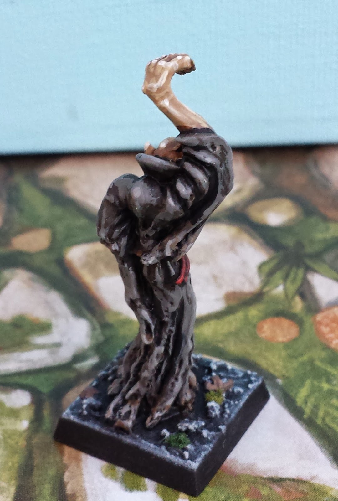
I'm glad I did. Here's one of my first photos with this background:


By way of contrast, below is the same miniature, taken with the same lighting, but using the white foam backdrop that was included in the Foldio:


The difference is astounding.  The blue background makes the entire miniature seem warmer and more vibrant. This is especially true for the orange flesh-tones -- through the magic of complementary colours, the blue lends them a lifelike glow. The graduated effect is also important. It gives the miniature a sense of being suspended in space. Finally, I think the deepening blue draws the eye upwards and into the faces of the miniatures. (Incidentally, the Yalta miniature is one of the Moments in History Vignettes offered by that excellent organ of our hobby, Wargames Illustrated.)


The backdrop that I'm using is the Flotone Graduated Background - 31" x 43" in Blue Jay colour. I bought it for $33.50 from B&H Photo Video in NYC (+$18 in shipping and duties to Canada). B&H was a fast and pleasant retailer. The Flotone itself is a heavy PVC material with a matte finish, making it sturdy and attractive.  In order to adapt it to the dimensions of my lightbox, I cut the massive Flotone into a number of smaller sheets.


Cutting up the Flotone was a handy thing to do since it allowed me to customize a number of continuums (continua?) of gradation from blue to white. This will be useful because I don't want too intense a blue behind miniatures that are themselves blue, for fear that the background will drown them out.

My only complaint about the Flotone is that it scuffs very easily. After taking a number of photos with it, its surface was marred by smudges from my miniature bases (as seen in the photo of this Mimic). These marks are easy to wipe away with a damp, soapy cloth, but the process of washing is a pain in the ass in the middle of a photography session. 

In sum, the Flotone Graduated backdrop is a fine product and a benefit to my photography. I now think of my backgrounds like I used to think of the base of the miniature -- a precious opportunity to highlight the figure itself.


Sunday, August 10, 2014

Naval Combat in Oldhammer: "All the Nice Dwarves Luv a Sailor"

Ship to ship combat -- with boarding parties, grapples and rams -- is the one thing missing from old school Warhammer Fantasy Battle. Or so I thought... until yesterday. I was flipping through an old White Dwarf, and stumbled on a short but pithy article by Gary Chalk. Mr. Chalk  is best known as an illustrator (creating the iconic drawings for Talisman and Lone Wolf), but he's also a modeler and a game designer extraordinaire.


His talents in all these respects are on full display in his article on naval combat. Even the title, "All the Nice Dwarfs Luv a Sailor" is the sort of goofy cultural reference that made vintage Warhammer so much fun. The rules themselves are a miracle of economy. There's little (i.e. no) emphasis on army points, or balanced rules. Instead, there are simple guidelines for bringing the ships together in a great smash and fighting infantry melees on the decks of each ship. It reminds me a little of how the Romans won the First Punic War: fight sea battles like they're actually land battles by rushing on to your opponents ship and throwing some stick around.


Naturally, "All the Nice Dwarfs Luv a Sailor" embodies the do-it-yourself ethos of the true hobbyist. It contains a useful template for constructing your own ships for 28mm miniatures, and tips for including such features as a winch-suspended cage of warriors that is to be swung over an opponent's ship and emptied on to the deck.The whole article is clearly designed to get miniatures on the table in the most chaotic and colourful way possible.

I'm hoping to get a couple of these scratch-built vessels for my own table - I may be ambitious and try to replicate (and scale-up) an elven ship from that great game, Man O'War. I'll keep the blog updated with my progress. 


Citadel Elven Ships for Man O'War (1992)

As I did a little research on these naval rules, I ran across the interview Gary Chalk did with the BBC journalist Samira Ahmed in 2012. It's clear that Mr. Chalk also pines for the days when Games Workshop emphasized creativity and freedom, rather than a rigid codex of rules: "People used to invent things -- E.g. dwarf hang-gliders and hot air balloons and invent rules to use them in the game. I came up with naval ships -- we called the game 'All the Nice Dwarfs Love a Sailor': -- they were fun add ons." He's not so keen on the current state of the hobby, summing up modern Warhammer in three words, "It's all pain."

For those who don't have access to White Dwarf 83, the best scan (much better than my own attempt) is found at the most excellent website of Project Aon, which is dedicated to the Lone Wolf books that Mr. Chalk illustrated. The pdf is here, and "All the Dwarfs Luv" starts at page 104. Let's hope Gary's great article continues to inspire a few more orcish Trafalgars!

Arrg!


It’s all pain.

Saturday, August 9, 2014

Foldio Light Box Review: Charge of the Light Brigade

This photo of two Oldhammer Dwarfs comes courtesy of my new Foldio Light Box from Orange Monkie.


When you photograph 28mm miniatures, everything depends on lighting. If you wish to expose the miniature's undercarriage, bring out the colours and capture detail, you will need theological quantities of light. With enough illumination, even the camera in a smartphone can take satisfying pictures (I use a Samsung Galaxy s4 and have always been pleased with its performance). But without light, even the best mini becomes a dingy turd.


When I first started this blog, I took my photos outdoors, in the shade of a sunny day (see the above Meazels from Otherworld Miniatures for an example). The results were tolerable, but there was a lot of inconvenience: the wind kept knocking over my backdrop, the lighting changed with the cloud cover, and there was an ever present danger of fresh air getting into my lungs. The obvious solution was a light box, either bought from eBay or made at home. Light boxes provide the dual benefit of concentrating light indoors while creating a smooth background for the mini. After reading some helpful advice, I decided to purchase the Foldio portable light box. 

I was attracted to the Foldio because it came with its own backdrops and a compact system of lighting, using lightweight LCD strips shining at the frequency of daylight. I also liked the fact that it packs up into a small, flat packet for easy storage.

There is a lot to like about the Foldio. It arrived at my door (to Canada from Korea) in just two days after ordering. As promised, it takes only seconds to set up, and creates a crisp environment for pictures. The lights are powered by 9-volt batteries, which means there aren't a lot of cables cluttering up the table. In sum, the Foldio is simple, easy and tidy. A picture of the same Meazels from my Foldio shows dramatic improvement: 


But the Foldio has limitations. It is small (10 inches across), so it's a poor solution for large dioramas or vehicles. Additionally, the coloured backdrop (which can be changed to your taste) is fastened to the inside of the Foldio by little more than goodwill. And the battery connectors for the light strips seem fragile, especially if 9-volts are repeatedly being inserted and detached. But the greatest drawback of the Foldio is that, as sold, it doesn't provide nearly enough light for 28mm miniatures, which leads to a lot of hidden costs. 

The basic Foldio is $49. I opted for the souped-up version ($59) with 2 LCD strips (both glued to the top of the light box). But with these two strips alone, this is the first picture I took of the Orc from Citadel's Talisman range:


In order to fully illuminate my miniatures, I needed to purchase three more LCD strips from Orange Monkie. I then jury-rigged stands for them so they could provide light for the flanks and bottom of the Foldio. (These stands are constructed with common hobby supplies: balsa wood, weighted down with heavy washers. I fasten the batteries to the back of the stands by way of a fridge magnet glued to the wood). 


When you add these extra light strips, plus a substantial amount of duties and shipping (not to mention batteries), my Foldio system has ballooned to almost $200. A do-it-yourself light box would have been vastly cheaper. On the other hand, the Foldio is convenient and elegant. Oh well. Light, like other precious commodities, can be surprisingly expensive.


Now That's an Orc!
Fully illuminated in a Foldio with 5 light strips


Sunday, July 27, 2014

Citadel Monsters III: Painting with a Twist


In the mid-1980's, the sculptors at Citadel hit upon a winning formula for making miniatures that gripped the imagination. In my view, the key to painting these minis is to understand this formula and exploit it. What is this secret sauce? Keep it simple. Add one twist to give the miniature flavour. But one twist is all you need.

For example, take the classic Chaos Hounds by Aly Morrison (1987). Even your grandma knows that Hounds of Chaos must be mutated, and obligingly, these dogs have spines, two heads and ebola. But each dog has only one mutation. Other than that, they are clean models. Absent are the layers of neck flaps, spikes and scales that festooned all the later iterations of chaos hounds. However, there is something else: in addition to each model's single mutation, there is one little twist. All the dogs are thin. Painfully thin. This simple, unifying detail makes the models stand out, and suggests a sinister idea to the viewer... these dogs are very hungry.


In order to paint these dogs properly, it's important to highlight the idea of thinness. So I used a very aggressive highlighting technique without too much blending in order to make their bones stand out as much as possible. I didn't want to distract from the idea of starvation, so I kept other flourishes to a minimum: the skin colour isn't particularly supernatural, the eyes are dark and the teeth modest. It's a simple approach, but it builds on the underlying idea of the miniature.


The "Vampire Attacking" (1986) from the Night Horrors range is another great example of Citadel's approach to sculpting. The vampire itself is clearly modeled on Max Schreck's Nosferatu and so features exactly what you'd expect: an elongated skull, large hands and a feral grimace. But on top of all of this is a beautiful twist: the model is reared into an S-shape, almost like a snake. It's a simple detail, but it gives the monster a haunting silhouette, just like the original Count Orlock. 


"Is this your wife? What a lovely throat."


I'm not sure why, but I've long harboured the suspicion that Games Workshop held secret sympathies for the American right wing. I'm not sure why.


In any case, I was delighted when I went to paint the male harpy by Iron Claw (Bob Olley, 1990?) and realized that he was the spitting image of Ronald Reagan (or maybe the spitting image of the Spitting Image of Ronald Reagan). Painting him to look like the Gipper wasn't hard - I just gave him luxurious black hair and a vacant stare.


"I'm from the government and I'm here to help."

In sum, a defining characteristic of Oldenhammer miniatures is a simple, clean sculpt. These minis are never cluttered with details, but there is usually one stylistic flare. My philosophy is that painting should highlight this flare, and should otherwise stay simple too. As a last example, I offer up this citadel Fire Elemental (Nick Bibby, 1985). I love the way its stretching arms are entwined in the column of smoke billowing off its head. Simple. Odd. Beautiful.


 "What hand dare seize the fire?"


Wednesday, July 16, 2014

Citadel Monsters Part II: How to get ahead in miniature painting


There'a a point in every man's life when he can finally step back and take the true measure of his own self. As I looked at my pics before pasting them on this post, I realized something important about myself as an artist. My only true specialty is painting acne.


"Nobody in advertising wants to get rid of boils."
He's half troll and half Billy Goat Gruff

At nearly every opportunity, I garnish my miniatures with big, juicy boils. This Cave Troll by Aly Morrison (1987) is a typical example. There's a lot going on in this sculpt. I love the goat horns and tusks emerging from the deeply textured face. I also love the unhealthy slabs of fat that sag from his body. But notwithstanding the other attractions of the miniature, I can't help from highlighting his boils and making them the centre of attention.


My acne painting technique is pretty simple. It's a final touch after the rest of the flesh is fully shaded and highlighted. I then mix a very small amount of red into the mid-tone of the miniature's skin, using this to slightly blush the area around the boil. I gradually increase the proportion of red in a smaller and smaller area, intensifying the circle of infection until it terminates in a bright pink circle. The pink is then crowned with an off-white dot (to create a white-head) or a green splotch (to create a pustule) or some combination of the two.


This Marauder Troll (1989) and Aly Morrison's Warrior Troll (1987) demonstrate the same dermatological issues. I'm particularly fond of the way acne looks on supernatural skin colours. Because they're contrasting colours, the green hues in these minis give the red boils a special glow. They seem to pop right off the skin.


Off they go, in search of Neutrogena!

In my view, these two sculpts exhibit how much Citadel miniatures changed (for the worst) from the mid-1980's to the late 1980's. The Warrior Troll from '87 is packed with energy. His limbs so compressed that he seems to lunge head first off of his base. This directs your eye to his expression (with its fierce under-bite) and his slapdash collection of armoured scraps. His weapon is there, of course, but it is more threatening for being held back.

The green Marauder Troll, on the other hand, presents a much less dynamic miniature. His face is as fantastic as every other Morrison miniature, but his pose is static. All the emphasis falls on his big stone club, which draws the viewer away from the miniature's face. This focus on weapons is a hallmark of most Citadel miniatures from 1990 to the present. But a weapon can never be as interesting as a really fat pimple.

Monday, July 14, 2014

Ravening Hordes: Five Sample Armies

One of my favourite parts of buying old Warhammer materials from eBay is that you never know what you're going to find when you tear off the paper from the parcel.  Recently I bought a near-mint boxed set of 2nd edition Warhammer, and to my delight, I discovered that it contained the rare double-sided insert from Ravening Hordes called "Five Sample Armies" (1987).

Ravening Hordes Five Sample Armies I

The sample armies are Orcs ("Blaccug's Butchers"), Dwarfs ("Dorin Delamroth's Dwarf Deathdealers"), Norse ("Audun's Ravens"), Dark Elves ("The Dark Elves of Drakir the Destroyer") and Wood Elves ("The Royal Horde of Gilander Gulino"). Somewhat like the old Marauder Army Deals, or the modern Saga warbands sold by Gripping Beast, this insert allowed you to buy an entire army in one go... imagine a day when you could buy 274 metal minis for £120.

This slender document is special because it exemplifies how a proper army list is made (no matter what edition of Warhammer or Oldenhammer you're going to play). It's not just a ledger. Every leader and every unit in the army is given a colourful name and a spot of history to make them stand out in the imagination of the players. And yet a whole thing reads as quick as a grocery list.

Ravening Hordes Five Sample Armies II

Another rare element in this document is the Norse army list, since this beautiful range of miniatures was largely neglected in subsequent editions of Warhammer.  We have great Viking names ("Halfdan the Chunderer" or "Magnus the Deep-Minded"), and we're treated to the entire war-chant of a berserker unit called "Asegir's Ale Artists":

Kill, kill, kill,
Main, main, main,
Murder, murder, murder,
Drink, drink, drink
Drunk last night,
Drunk the night before
Gonna get drunk tonight
Like we've never been drunk before!

They seem nice.

As usual for this era of Warhammer, there's a truckload of violent alliteration ("Madman Mingo's Mounted Molesters"). I was also pleased to see that the Elven list features Riolta Snow. Oldenhammer fanatics will know her as the elven adventurer who pops up in other scenarios, like the Magnificent Sven and Terror of the Lichemaster.

Anyway, if you'd like a PDF of Five Sample Armies from Ravening Hordes (1987) for Warhammer 2nd Edition, here you are:

Five Sample Armies page 1.pdf - Google Drive

Five Sample Armies page 2.pdf - Google Drive


Riolta Snow

Friday, July 11, 2014

Citadel Monsters: Testicles, Spectacles, Wallet and Watch

During the 1980's, Citadel made some of the best monsters that have been rendered in lead. The reason for their success is simple: they were sculpted to emphasize personality and character. A harpy isn't just a harpy -- it's a harpy that looks like Ronald Reagan. A dragon isn't just a dragon -- it's a potbellied drake with a pocket watch, half lizard and half merchant banker. And a giant isn't just a giant -- it's a knuckle-dragging Scots cyclops.


The Citadel giant (1987) was a lot of fun to paint. I wanted to make him seem old and unhygenic, but also robust, a little like Boris Yeltsin in his sunset years. I tried to achieve this sozzled effect by covering his pink skin with veins, wrinkles and liver spots. To underline his struggles with the bottle, I gave him a bloodshot eye and a nose ravaged by rosacea. I also added a cask of brandy to his belt and another discarded on the ground. The nearby toadstools are greenstuff and wire -- the dead bush is a painted twig from a smokebush tree.


There was one thing that troubled me about this miniature: he was wearing a short kilt, but there was nothing underneath it. This seemed a rare oversight on the part of sculptor Nick Bibby and a slander to Scotsmen everywhere.  And so to remedy this anatomical omission, I fashioned a little set of tackle out of greenstuff, and carefully pared it back with my modelling knife. The key was to achieve a sense that even though time has made this fellow sag, he is still proud of the family tartan.

Perhaps you'd like a close-up?


The Blue Dragon (1987) is another beauty of a miniature. I love the fact that it isn't slithering or rearing or launching into the old claw/claw/bite routine. Rather, this dragon is merely squatting and looking at the viewer through narrow, crafty eyes. The raised claws suggest that perhaps it is getting ready to cast a spell (a truly unusual pose for a dragon). But I prefer to think that this dragon just likes to talk. "Hmmm," he seems to be saying, "You seem to be a smart sort of fellow. I've a real estate opportunity in Florida for your ears only."


"Coffee's for closers only."


I love Jes Goodwin's Manticore (1987) because his face bears a striking resemblance to Dee Snider from Twisted Sister. In order to do justice to this magnificent sculpture, I tried to make him look as much like a hair-metal lead man as possible.  To emphasize his grimace, muscles and feathered hair, I used a very aggressive highlighting technique.


The wings and tail of the manticore display the pleasing effect that can be achieved simply by dry-brushing a carefully sculpted metal miniature. But something is missing... No glam rocker is complete without a spattering of leopard print, so I decided to make this particular manticore a lion in the front and leopard in the back. The leopard pattern isn't difficult to achieve: start with a base of tan brown, highlighted up to a desert yellow. Add some splotches of orange which are are then (very) roughly bordered by dots and curves of medium-dark brown paint. Now he's ready for the Hammersmith Apollo!


"We're not going to take it anymore!"